



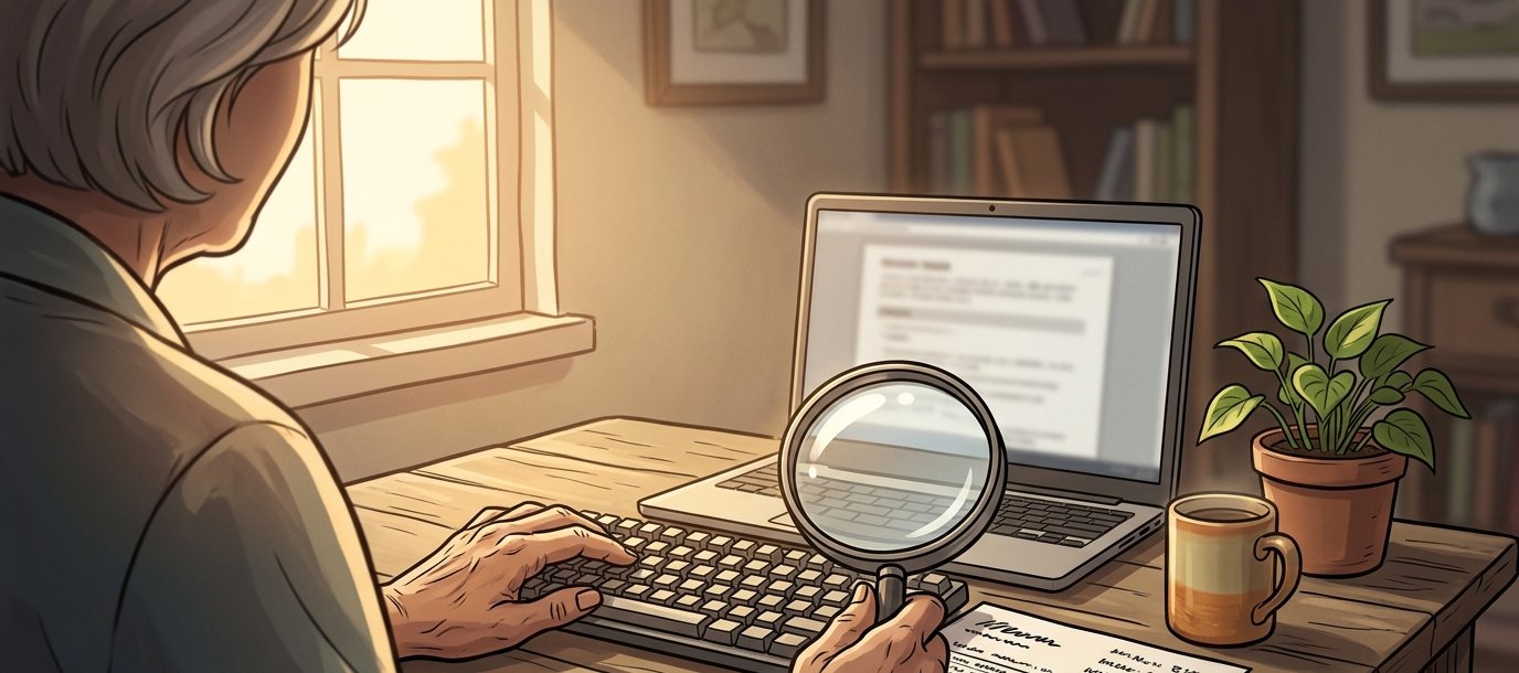
A woman in her sixties is trying to book a service on a website. She’s used a screen magnifier for years and manages perfectly well on most sites. On this one, the form labels sit above fields in pale grey, and at her magnification the label and the field it belongs to are never on screen together. She fills in the form, guesses wrong somewhere, gets an error message that says “please check the highlighted fields,” and can’t find them.
She rings instead, and the business counts that as a phone enquiry. Nothing appears in any report as a problem. The site works, in the sense that it didn’t break.
Most accessibility failures look like that. There’s no complaint to respond to. The customer just goes elsewhere, and the business never finds out it lost her.
Who does this actually affect?
More people than most businesses assume. According to the Australian Bureau of Statistics, around one in five Australians live with disability, a little over 21 per cent at the last Survey of Disability, Ageing and Carers. If one in five of your customers had trouble getting through your front door, you’d notice. Online, you usually don’t.
And that figure undercounts it, because the same work helps plenty of people who’d never describe themselves as disabled. A broken wrist has you navigating by keyboard for six weeks. Low-contrast text vanishes when you’re reading your phone in bright sun. Half the people on a train watch video with the sound off. And most of us find small text harder at sixty-five than we did at thirty. Build for the demanding case and the ordinary case gets better along the way.
What does Australian law say about website accessibility?
The Disability Discrimination Act 1992 makes it unlawful to discriminate in the provision of goods, services and facilities. It doesn’t mention websites, because it predates the commercial web, and it doesn’t need to. The provisions are about services, and a website is how most services are now provided.
It has been tested, too. In Maguire v Sydney Organising Committee for the Olympic Games, decided in 2000, the Human Rights and Equal Opportunity Commission found that the Sydney 2000 Olympics website was inaccessible to a blind user, ordered changes, and awarded damages when they weren’t made. That was more than twenty-five years ago, so this is hardly a new obligation.
The practical standard is the Web Content Accessibility Guidelines, known as WCAG, currently at version 2.2, with three conformance levels: A, AA and AAA. AA is the benchmark almost everyone means, and it’s what Australian government digital services are held to. For a private business, WCAG 2.2 AA is the sensible target, and it’s the level most procurement processes will ask about if you sell to government or to large corporates.
Why is it cheap early and expensive later?
Because most of it comes down to decisions made during design and build, and those cost almost nothing to get right at the time.
Choosing a colour palette with adequate contrast costs nothing during design. Changing it after launch means revisiting every screen, every email template, every piece of collateral built from it, and having the brand conversation again with people who signed it off. Building a form with properly associated labels is how a competent developer builds a form anyway. Retrofitting labels across forty forms is a fortnight nobody budgeted for.
That’s true of nearly everything on the list below. Handled during the build, it adds very little and nobody notices it’s there. Left until afterwards, it turns into a project of its own. So it’s worth raising at the start of a project rather than in the fortnight before launch.
What actually matters most?
A handful of website accessibility fixes resolve the large majority of real-world barriers.
Contrast. Text needs to be readable against its background. Pale grey on white is the failure we see most often, and it takes minutes to correct.
Keyboard access. Everything you can do with a mouse should be possible with a keyboard, in a sensible order, with a visible indicator of where you are. If you can’t tab through your own checkout, neither can a portion of your customers.
Labels and form errors. Every field labelled, in a way a screen reader can associate with the field. Errors that say what’s wrong and where, in text, not only in colour.
Alt text on images that carry meaning. A description of what the image conveys. Decorative images should be marked as decorative rather than described, which is the half of this rule people miss.
Real headings. Headings marked up as headings rather than styled to look like them. Screen reader users navigate by heading structure the way sighted users skim a page.
Captions on video. Useful for deaf and hard-of-hearing users, and used constantly by everyone watching with the sound off, which is most people on a phone.
There’s a lot more to WCAG than that, but those six account for most of what actually stops people using a site, and none of them needs a specialist programme.
What about the overlay widgets?
You’ve probably been offered one: a line of JavaScript, added to your site, that puts an accessibility button in the corner and promises compliance. It’s an appealing pitch, and I’d be cautious about it.
These tools sit on top of a site and try to correct problems automatically at the point of viewing. They can do a few genuinely useful things, largely around presentation: text sizing, contrast toggles. What they can’t do is understand what your images mean, reorder a form that’s structured illogically, or make a custom component that was never built to be operable become operable. The underlying problems remain, because they’re in the site itself.
Many people who use assistive technology also have their own carefully configured setup, and a script that intervenes in the page can get in its way. Overseas, a good number of accessibility complaints have been filed against sites that had an overlay installed at the time, which rather undermines the promise.
If a widget helps some of your visitors, fine. Just don’t buy it as a substitute for the work.
The commercial case, briefly
I’d rather make the plain argument than the moral one, because businesses act on the plain argument.
An inaccessible site loses transactions you never see. Nobody fills in a complaint form to tell you they gave up at checkout. Accessibility work overlaps heavily with things you already want: clean semantic structure, sensible headings, real text instead of text baked into images. That’s why accessible sites tend to be easier for search engines and AI answer engines to read as well. It’s increasingly a procurement requirement. And it removes a category of legal exposure that has existed in Australia since 2000.
The way this usually goes wrong is an audit commissioned three weeks before launch. It produces a list of two hundred issues, thirty get fixed, and the rest become a document nobody opens. Asking for it to be built properly at the start mostly costs a conversation.
Wondering where your site stands?
Contact our team to talk through what accessibility means for your build.
Simon Paul is a Business Solutions and Technology Specialist at Code Brewery who’s spent 25+ years turning business ideas into software that actually earns its keep. He’s yet to see a project where building accessibility in cost more than bolting it on. Reach out to Simon to talk through what your site needs.
 4.9
4.9  71
71 


