


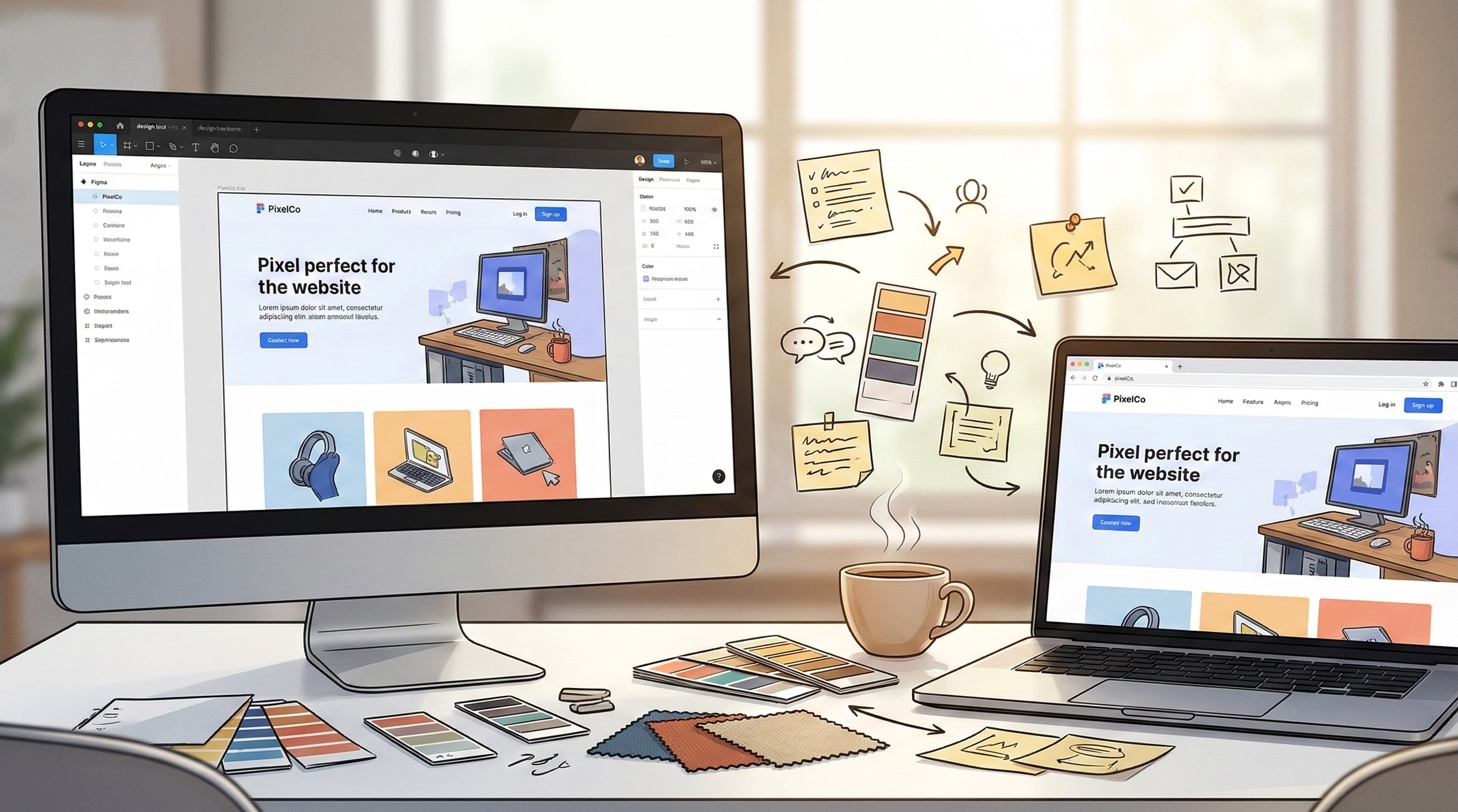
There’s a moment in almost every project where the design looks perfect in Figma and the build looks… different. Not wrong, exactly. But not what was envisioned.
It’s one of the most common friction points in digital production, and it’s almost never about the quality of the design or the capability of the development team. It’s about the translation layer between them.
As the team who takes design files and turns them into working code, we’ve spent 15 years in that translation layer. And the most useful thing we can share isn’t a list of technical constraints. It’s what we’ve learned about where the gaps tend to appear and how collaborative teams close them before they become expensive problems.
Why the Gap Exists
Design tools and browsers operate under fundamentally different rules. A design tool is a canvas with near-infinite control. A browser is a rendering engine that interprets instructions across thousands of device and screen combinations, each with its own quirks.
That difference isn’t a flaw in either discipline. It’s just the reality of translating static compositions into dynamic, interactive, responsive experiences.
Design tools don’t have scroll behaviour. A beautifully composed full-page layout may look stunning at exactly 1440 pixels wide. But it needs to work at 375 pixels on a phone, 1920 on a widescreen monitor, and everything in between. How elements reflow, stack, and resize is a set of decisions that static mockups can’t fully express.
Interactivity exists in the gaps between screens. A mockup shows state A and state B. The experience of moving between those states, how elements animate, how transitions feel, how loading states communicate progress, lives in the space between designed screens.
Content is rarely as tidy as placeholder text. Layouts built around perfectly measured headlines and evenly cropped images meet real-world content that’s longer, shorter, differently proportioned, or missing entirely. How a design handles the unexpected is hard to spec in a static file.
Performance is invisible in mockups. A hero section with a full-screen video background, parallax scrolling, and animated typography looks incredible in a presentation. Whether it performs smoothly on a mid-range Android phone over a 4G connection is a separate question entirely.
Where We See It Go Well
The projects that translate most faithfully from design to build aren’t necessarily the simplest ones. They’re the ones where the conversation between design and development happens early and often.
Shared understanding of the priority hierarchy. When the team agrees on what’s essential to the creative vision versus what’s flexible, developers can make informed decisions during implementation instead of guessing. “The animation timing on this hero transition is critical to the feel” is much more useful than discovering after the build that a particular detail mattered deeply.
Designing with real content in mind. When design teams explore what happens when a headline runs to three lines instead of one, or when a product image is portrait instead of landscape, the design itself becomes more resilient. The build reflects that resilience because the edge cases were considered before code was written.
Early technical conversations about interaction. A 30-minute conversation about how a complex interaction should feel, before detailed design begins, can save days of revision later. Not because the technical team should dictate creative direction, but because understanding the implementation landscape helps creative teams make choices that translate cleanly.
Component thinking from both sides. When designers think in reusable patterns and developers build in modular components, the two mental models align naturally. Changes become simpler because everyone’s working from the same structural logic.
The Details That Trip Up the Best Teams
Even experienced teams encounter a handful of recurring translation challenges. Knowing where they tend to appear makes them easier to address.
Typography rendering. Fonts render differently across operating systems and browsers. A typeface that looks crisp and elegant on a Mac Retina display may render heavier or differently spaced on Windows. This isn’t a development error. It’s a rendering reality that’s worth previewing early.
Colour consistency. Colours that look identical in a design tool can appear different in CSS depending on colour profiles, screen calibration, and blending modes. Transparent overlays and gradients are particularly susceptible. A quick browser check during the design phase catches discrepancies before they become revision rounds.
Responsive breakpoints. The spaces between defined breakpoints are where layouts most commonly break. A design might spec desktop, tablet, and mobile, but the transitions between those widths contain dozens of intermediate states where elements can overlap, wrap unexpectedly, or create unintended gaps.
Scroll and animation performance. Animations that feel smooth in a prototyping tool may struggle in a browser, particularly on lower-powered devices. The complexity threshold isn’t always obvious. Sometimes a subtle approach actually feels more polished than an elaborate one because it performs consistently across the full range of devices people actually use.
Third-party content. Embedded maps, social feeds, video players, and advertising scripts all inject their own styling and behaviour. They rarely respect the carefully designed spacing and visual hierarchy around them without specific technical handling.
Questions We Find Useful to Explore Together
These aren’t prescriptive. They’re conversation starters that we’ve found help design and development teams align before the build starts.
What’s the creative non-negotiable? Every design has elements that define the experience and elements that support it. Knowing which is which helps the build team protect what matters most.
Where does this need to feel identical versus equivalent? Some elements need to look exactly the same everywhere. Others can adapt to their context as long as the intent carries through. That distinction gives developers room to make smart implementation choices.
What happens when content doesn’t cooperate? Real content is unpredictable. Discussing overflow, truncation, and empty states during the design phase prevents awkward surprises during QA.
How should this feel on a slower device? Agreeing on a graceful degradation strategy early means the team can build progressive enhancement into the architecture rather than stripping features out under deadline pressure.
What’s the handover format that works best? Some teams work best with annotated Figma files. Others prefer a quick walkthrough call. The format matters less than ensuring both sides have a shared understanding of intent, not just pixels.
The Bottom Line
The gap between mockup and build isn’t a problem to solve. It’s a translation challenge to manage. And like any translation, it works best when both parties understand each other’s language.
The most successful projects we’ve been part of aren’t the ones where the design was technically simple. They’re the ones where design and development teams treated the translation as a shared responsibility from the start, rather than a handover from one discipline to another.
Creative vision and technical execution aren’t opposing forces. When the conversation between them starts early and stays open, the build doesn’t just match the mockup. It often improves on it, because working in the real medium surfaces opportunities that static compositions can’t anticipate.
That’s the kind of collaboration we find most rewarding. And it starts with a conversation.
Bridging the gap between design and build?
Contact our team to discuss how early collaboration makes the translation smoother.
Simon Paul is a Business Solutions & Technology Specialist at Code Brewery who’s spent 25+ years taking ambitious creative concepts and turning them into production-grade digital experiences. He’s learned that the best builds happen when design and development share a common language from day one. Reach out to Simon to discuss how your creative vision might translate into build.
 4.9
4.9  70
70 